Blog

If you run a business, you already know how much competition is out there. Everyone’s fighting for attention, whether there are in Lancaster city, somewhere else in Lancaster County, or across the country competing with you online. But here’s something a lot of local business owners don’t think about: the fight for customers starts before they ever walk through your door or pick up the phone. It starts on Google.
Provide multiple calls to action on important web pages.
January 8, 2026

One often overlooked need when developing a page’s content is asking the site visitor to do something. Each of these is a CTA (a call to action). The longer a web page is, and the more content zones that are on the web page, the more calls to action should be implemented. Why? Because you never know at what point the user may be ready to act. So why not prompt them?
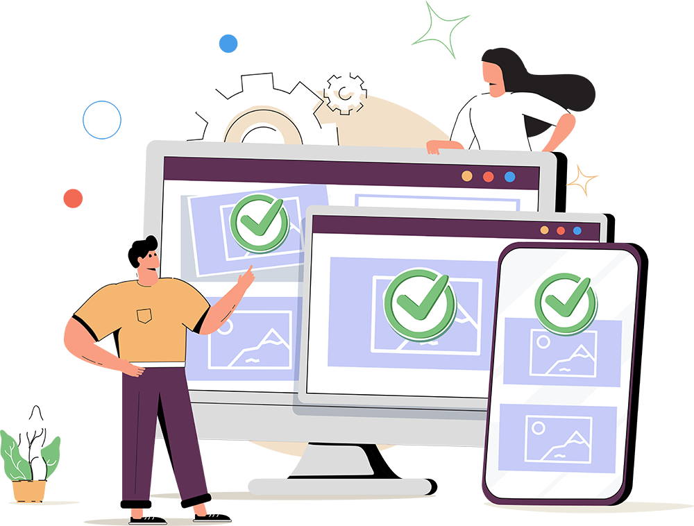
Responsive design is a method to create websites so they are able to adapt for different web users for optimal viewing across a variety of types of devices. More specifically, it’s their different screen sizes. Often time, people use the phrase “mobile friendly,” which is correct. Responsive design is that same idea, but with a lot more finesse.

So you’re thinking about making changes to your company’s website. That’s great. And yes, I’m sure we can help you. But when it is time to start the project, don’t start by thinking about design. Don’t start by thinking about the changes the people down the hall have told you they would like to see. And definitely don’t start by thinking about what you think needs changed only because you are sick of staring at the same page content for the last five years. Instead, start by looking at your website analytics to see what is already working so you don’t take a step backwards.