Responsive design can help you better communicate to your customers.
And Google’s search algorithm will love you more, too.
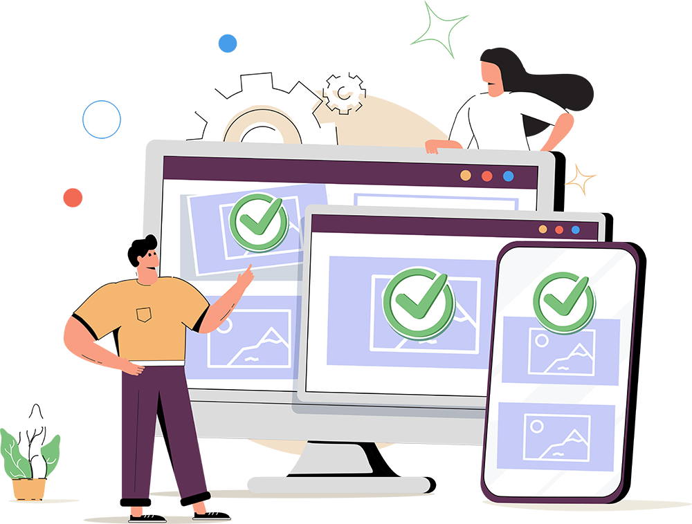
Responsive design is a method to create websites so they are able to adapt for different web users for optimal viewing across a variety of types of devices. More specifically, it’s their different screen sizes. Often time, people use the phrase “mobile friendly,” which is correct. Responsive design is that same idea, but with a lot more finesse.
The good news for iComm’s clients is that we have been developing websites with responsive design for a very long time. It’s a core stage in all of our new website projects. A site using excellent responsive design means that regardless of the user’s screen size, they can find, consume, and engage with the content in an easy manner without sacrificing readability or the desired branding.
iComm can provide a specific user experience for various display sizes related to devices such as mobile phones to tablets to laptops to larger desktop screens. Within each of these types of devices resides various screen resolutions.

The ever-growing need for responsive design.
The proliferation of mobile and tablet web browsing has changed how and when people access the web. In fact, in the United States, most web site traffic occurs on mobile and tablet devices instead of larger screens (what is typically called “desktop” viewing). This means people are using their smaller devices — even for business needs — whether at the office, on the sofa or anywhere else. And because of that, they expect a good experience. And if the website is not easy to use or read, they will find another site for their needs.
One of the features of responsive design is the ability to choose a specific image to show for a specific screen size. That means, our development team can create multiple images that are different sizes, or even different aspect ratios, then we choose which ones to automatically display. The end result is we can load smaller images that are also lighter in byte count so the page loads faster for mobile users that are not on WiFi. And if you are a fan of SEO, you probably already know that page speed is a critical factor for ranking. More specifically, mobile page speed is a critical factor, even for people doing searches on desktop as the mobile speed is what Google uses in its algorithm.
How we got to responsive design.
In the past, web developers would create one design that was of a specific size that most people were able to view at 100% of its width. Then, it would be coded to work for all users, regardless of the screen size. That means people would see very small text and images on mobile devices. Not very helpful.
The next stage was when developers created code that detected if a person was using a mobile phone, and then the developer could choose to show a separate “mobile-only” site to those mobile users. This meant more initial development work, and more updates to a second website for when the content needed to change (two websites, not just one website).
As newer “smart phones” emerged such as iPhone and various Android devices, their web browsing could handle more capabilities and the sites began to appear on larger mobile screens. While mobile-only sites still were being developed, new HTML Code was being developed (starting in 2010) that allowed websites to detect the device type/screen size and then change the site look as needed (layout, image sizes, which copy to show, which images to show, font sizes, navigation styles, etc.). This new practice was coined “responsive design.”
It is “responsive” because the site “responds” to the user’s screen size and aspect ratio. It is also the marketer (the site) being “responsive” to the experience of the site visitor, giving the site visitor better usability.

How responsive design can be helpful.
The smaller the screen size, the more confusing it can be to navigate a website and read content. With responsive design, iComm can move items on the page that hinder the primary goals of the page (such as getting information or adding a product to a shopping cart).
For example, imagine a page full of current sales that have images and text. On a traditional desktop monitor or laptop, the images could be large and page scrolling may be needed, but easy to do.
On a tablet, everything becomes smaller, but could still be possible without any major issues.
But on a mobile device, we could make only the product names and prices show and hide the images, or at least make the images smaller.
This would make it very easy for people to quickly find the specials and read them clearly.
Long-term budget benefits of responsive design.
Using responsive design techniques, you still have initial development time and cost, but the managing of the content for the future is much more efficient. The code will automatically change sizes of elements, and various elements can be moved or hidden as needed.
If you would like to know more about how responsive design, please contact us. I’m sure we will be responsive (sorry, that was too easy).